
GLANSIS Website Redesign
Client: National Oceanic and Atmospheric Administration (NOAA)
Project Duration: 15 Weeks (Fall '23)
Figma File: Click Here
Scope: Homepage and Species List Generator Redesign (Low Fidelity)
The Great Lakes Aquatic Nonindigenous Species Information System (GLANSIS) is a one-stop shop for information about aquatic nonindigenous species in the Laurentian Great Lakes region of North America.
Executive Summary
The current GLANSIS website looks outdated, and navigating the website is not very intuitive. In addition to the visual uplift for the interface of the GLANSIS website, I redesigned the Species List Generator, which is the most commonly used tool.
Rather than having pages that were designed to be printed, users can now generate lists of species that are much easier to parse through on screen; I also made the species profile pages more legible so that users can find relevant information more easily.
Problem Statement
The GLANSIS website is a snapshot of the past, providing users with an outdated interface that does not follow many standard heuristics for UI design. The result is that users like state/federal managers and researchers cannot find the information they need. Tools like the species list generator do not intuitively present information to users. This causes regulatory and permit approval processes to slow down, contributing to socioeconomic and environmental impacts that have consequences for humans and other species.


Current GLANSIS designs
Scroll to see the process ↓
Client Interviews
At the beginning of this project, we had the opportunity to interview Dr. Rochelle Sturtevant (program manager for GLANSIS) to understand what current problems existed within the GLANSIS website.
She first highlighted the impacts that the poor user experience of the website had. A state or federal manager might go to GLANSIS and look at risk assessments if they've been asked to approve a permit to import a species. Another use case, for example, is if a resource manager wants to know what invasive species are in their local management area that they should control. In this case, they should use the species list generator tool and enter their HUC code to create a spreadsheet of all the invasive species in the area. However, with the current interface design of the website, she explained that tasks like the ones described above are not simple enough to complete. Ultimately, this results in socioeconomic and environmental impacts like habitat alteration, negative effects on human health, and impacts on the food web.
Dr. Sturtevant also talked how the number one complaint with the current website is that users cannot find what they need. She also noted that the species list generator was the most used tool which is why I focused my redesign on this tool.
First iteration of redesign
For my first round of redesigns, I stuck to the smallest (mobile) breakpoint so as not to overburden myself with too many things at the beginning of this project.


Second iteration of redesign
For my second round of redesigns, I mainly focused reworking the homepage. I incorporated chunking and made better use of icons, both of which improved the organization and information flow of the page.


Final iteration of redesign
My final draft of the redesign includes both the mobile and desktop breakpoint. Scroll further down to see my key design decisions.
Mobile


Desktop (Before & After)


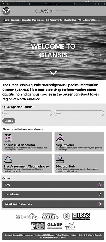
Key Design Decision #1: Chunking on the Homepage
I made use of chunking on the homepage so that users can easily distinguish between the primary tools GLANSIS offers and the rest of the information contained on the page. The use of chunking gives the page structure and organization, and aids in the overall ease of navigation for the website.
Key Design Decision #2: Species List Filtering
I added various list filtering options on the landing page for the species list generator. This allows users to narrow down their list which will help users find information more quickly. Additionally, users no longer have to go back to the species list generator page to change the filtering options of the landing page.

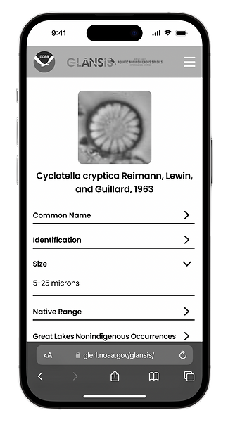
Key Design Decision #3: Accordion for Species Profiles
Originally, the species profile pages were extremely dense and unformatted. Finding information was difficult because of the small text and immense amount of scrolling required. I created an accordion with dropdown sections to mitigate this issue. Each profile page is divided up into ten expandable sections, making it much easier for the user to find the information they need and reducing the need for endless scrolling.
If I had more time...
This was my first UX project and doing so for a college course certainly had some limitations. If I had more time to work on this, I would take my design from low to high fidelity, implementing a unified color palette. Additionally, I would conduct in depth user tests for the current website and my designs, calculating SUS (system usability scale) scores to see how my ideas improved the usability of GLANSIS.